This is my first actual blog post.
Fuck Taylor Yurcich.
Sunday, December 13, 2009
Friday, May 29, 2009
Tuesday, September 23, 2008
Wednesday, September 17, 2008
Monday, September 15, 2008
Thursday, September 11, 2008
Anitmated Logo Desgin Soccer Man
This is my soccer logo from photoshop that I made in the first few classes of grade 12 media arts, its pretty bad but this is a rough attempt.
Tuesday, June 3, 2008
Wednesday, April 2, 2008
Thursday, December 6, 2007
Wednesday, November 14, 2007
Unit 1 Summative 1

Digital Artist Canvas
Self Reflection
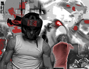
1. The theme of my work is boxing, more specifically training in boxing. It seemed like a good idea to take pictures of something I do so often and make something out of it. The theme is also the hard work that you put into working out, and the feeling you get after putting in so much time and effort and having it all pay off.
2. I wanted to do this because I personally love boxing and it was a lot of fun to have someone take pictures of a particularly good part of the boxing training while I was sparring. It was something that I had wanted to do for so long because I love taking pictures or at least seeing pictures of anything athletic and I had never seen myself doing this training except in a mirror, so it was useful for the project as well as personally.
3. I used new photographs of a recent training session because I had never had anyone take photos of that before. Nathan took really great photos that worked well with the image that I was going to create, and the theme of the hard work and training. The blurred effect because there is so much motion in the photos actually worked to my advantage because it helped to create speed and make the image less static.
4. I used choppy, intense lines and blurred edges to give the image the feeling of movement, to better convey what was happening in the pictures. I tried to fill the negative space as much as possible so there is always something to look at in the photo that may not have been obvious before, such as the reflection in the top left area of the boxer in the mirror and the heavy bag behind him. I created a strong foreground with the picture of myself clearly defined and blurry large images in the background. Medium sized photos and the red highlights draw attention to certain areas and make looking at the image interesting because your eyes travel across it in different ways each time you see it. The visual texture is smooth to look at even though there is so much energy.
5. I think that the shape has added most to my work, because there are certain silhouettes that are easily recognizable in boxing. Even very blurred, in grayscale and sometimes cutout, the outlines of the shapes like the headgear, gloves, the blurring motion of a punch, heads moving and muscles working is easy to identify.
6. It would be hard for me to choose my favourite picture in my image, mostly because they are all of me. Also though because one of the reasons I like this image is when you have seen an entire photo, like the foreground photo of me, you can look at another one and appreciate it as well. I like the big photo of myself in the front, the top right photo of my punch about to hit the other boxer, (my fist is highlighted in red) and the photo immediately to the bottom right of the main foreground image, where my shirt in highlighted in red.
7. One hard thing about working in this way was it was hard to highlight certain things of importance in the red. I would have liked to just select certain areas and highlight them better; you can see that in some cases I just added red using the paint tool. This would have let me draw attention to some things more effectively, but in most cases it worked out pretty well.
Monday, September 24, 2007
Unit 1 Formative 1

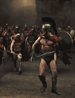
This is the first photoshop of the year that we have done so far. The idea was to create an image that was never real but looked real enough to fake you into believing that it could have happened. I created a new Spartan from pictures of all the other guys edited together to make a guy that looked real but never existed.
Subscribe to:
Comments (Atom)


